Machine learning models are only as valuable as their ability to make correct decisions. While building predictive models is a core activity, evaluating their performance accurately determines whether they can be trusted in real-world scenarios. Among the many evaluation metrics available today, AUC ROC analysis has emerged as one of the most widely accepted approaches for assessing classification models.
The importance of proper evaluation becomes even more significant when models are used in high-stakes applications such as healthcare diagnostics, fraud detection, autonomous systems, and financial forecasting. This guide explores how AUC ROC analysis works, why it is preferred, and how it helps data scientists make informed decisions.
Understanding Classification Performance Metrics
Classification problems involve predicting discrete class labels such as positive or negative outcomes. Several metrics exist to measure how well a classifier performs.
Commonly used classification metrics include:
- Accuracy
- Precision
- Recall
- F1-score
- Confusion matrix-based measures
Although these metrics are useful, they often fail to provide a complete picture of model performance. This is where AUC ROC analysis becomes essential, as it evaluates model behavior across multiple classification thresholds.
What Is AUC and Why It Matters
AUC stands for Area Under the Curve. In machine learning, it typically refers to the area under the ROC curve. The AUC value measures how well a model can distinguish between positive and negative classes.
An AUC score ranges from zero to one:
- AUC close to one indicates excellent model performance
- AUC around zero point five suggests random guessing
- AUC below zero point five indicates inverted predictions
The strength of AUC lies in its ability to summarize classification performance into a single scalar value while considering all possible thresholds.
The Concept of the AUC Curve
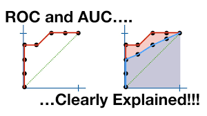
The AUC curve represents the cumulative ability of a classifier to rank positive instances higher than negative ones. Rather than relying on a fixed decision threshold, it evaluates ranking quality across the full range of thresholds.
This makes AUC particularly useful in scenarios where operating conditions may change or where costs associated with false positives and false negatives vary.
An image illustrating the AUC curve should be included here.
ROC Curve Fundamentals Explained
ROC stands for Receiver Operating Characteristic. The ROC curve plots the true positive rate against the false positive rate at various classification thresholds.
Key components of the ROC curve include:
- True Positive Rate, also known as recall or sensitivity
- False Positive Rate, representing incorrect positive predictions
Each point on the ROC curve corresponds to a specific decision threshold. By sweeping through thresholds, the curve visualizes model performance comprehensively.
Relationship Between AUC ROC and Model Discrimination
AUC ROC analysis measures a model’s ability to discriminate between classes. Discrimination refers to how effectively the model separates positive instances from negative ones.
A model with higher AUC ROC is better at ranking positive examples above negative examples regardless of the classification threshold used. This property makes AUC ROC especially valuable in ranking and scoring applications.
Mathematical Intuition Behind AUC ROC Analysis
From a probabilistic perspective, AUC represents the probability that a randomly chosen positive instance is ranked higher than a randomly chosen negative instance.
Mathematically, this interpretation provides an intuitive understanding of why AUC ROC analysis is threshold-independent and robust to class distribution changes.
How Thresholds Impact ROC Curves
Threshold selection plays a critical role in classification decisions. A lower threshold increases sensitivity but also increases false positives. A higher threshold reduces false positives but may miss true positives.
The ROC curve captures this trade-off visually, enabling practitioners to select optimal thresholds based on business objectives rather than arbitrary defaults.
Interpreting AUC Scores Correctly
While AUC ROC analysis is powerful, it must be interpreted carefully.
General interpretation guidelines include:
- Values above zero point nine indicate strong discrimination
- Values between zero point seven and zero point nine indicate acceptable performance
- Values below zero point seven suggest limited discriminative ability
However, context matters. Even a moderate AUC may be acceptable depending on the application domain.
Import Required Libraries
import numpy as np
import matplotlib.pyplot as plt
from sklearn.datasets import make_classification
from sklearn.model_selection import train_test_split
from sklearn.linear_model import LogisticRegression
from sklearn.metrics import roc_curve, roc_auc_score
Create a Sample Binary Classification Dataset
This simulates a real-world classification problem.
X, y = make_classification(
n_samples=1000,
n_features=10,
n_informative=6,
n_redundant=2,
random_state=42
)
Split Data into Training and Testing Sets
X_train, X_test, y_train, y_test = train_test_split(
X, y, test_size=0.3, random_state=42
)
Train a Classification Model
Here we use Logistic Regression, a common baseline model.
model = LogisticRegression(max_iter=1000)
model.fit(X_train, y_train)
Predict Probabilities (Required for ROC & AUC)
ROC and AUC must use probabilities, not class labels.
y_probs = model.predict_proba(X_test)[:, 1]
Calculate ROC Curve Values
fpr, tpr, thresholds = roc_curve(y_test, y_probs)
- fpr → False Positive Rate
- tpr → True Positive Rate
- thresholds → Decision thresholds
Calculate AUC Score
auc_score = roc_auc_score(y_test, y_probs)
print("AUC Score:", auc_score)
Plot ROC Curve
plt.figure()
plt.plot(fpr, tpr, label=f"AUC = {auc_score:.3f}")
plt.plot([0, 1], [0, 1], linestyle="--")
plt.xlabel("False Positive Rate")
plt.ylabel("True Positive Rate")
plt.title("ROC Curve")
plt.legend()
plt.show()
ROC & AUC for Multiple Models (Comparison Example)
from sklearn.ensemble import RandomForestClassifier
from sklearn.svm import SVC
models = {
"Logistic Regression": LogisticRegression(max_iter=1000),
"Random Forest": RandomForestClassifier(),
"SVM": SVC(probability=True)
}
plt.figure()
for name, clf in models.items():
clf.fit(X_train, y_train)
probs = clf.predict_proba(X_test)[:, 1]
fpr, tpr, _ = roc_curve(y_test, probs)
auc = roc_auc_score(y_test, probs)
plt.plot(fpr, tpr, label=f"{name} (AUC = {auc:.3f})")
plt.plot([0, 1], [0, 1], linestyle="--")
plt.xlabel("False Positive Rate")
plt.ylabel("True Positive Rate")
plt.title("ROC Curve Comparison")
plt.legend()
plt.show()
Interpreting AUC Values in Code
if auc_score >= 0.9:
print("Excellent model performance")
elif auc_score >= 0.8:
print("Good model performance")
elif auc_score >= 0.7:
print("Fair model performance")
else:
print("Poor model performance")
Real-World Use Case Example (Credit Risk)
# Predict probability of loan default
default_probability = model.predict_proba(new_customer_data)[:, 1]
if default_probability > 0.7:
decision = "Reject Loan"
else:
decision = "Approve Loan"
Real-World Example: Medical Diagnosis Systems
In medical diagnostics, AUC ROC analysis is commonly used to evaluate disease detection models. These systems must balance sensitivity and specificity carefully.
For example, a cancer detection model with high AUC ensures that most patients with the disease are correctly identified while minimizing false alarms. Medical researchers prefer AUC ROC because it provides insight across multiple decision thresholds.
Real-World Example: Credit Risk Modeling
Financial institutions rely heavily on AUC ROC analysis when evaluating credit scoring models. The ability to rank risky applicants above safe ones is crucial for minimizing loan defaults.
AUC ROC analysis allows banks to compare competing models objectively and choose the one that offers better risk discrimination.
AUC ROC vs Accuracy: Key Differences
Accuracy measures the proportion of correct predictions but can be misleading, especially with imbalanced datasets.
AUC ROC analysis provides a more reliable assessment by focusing on ranking ability rather than absolute prediction counts. This makes it more robust in real-world scenarios where class distributions are skewed.
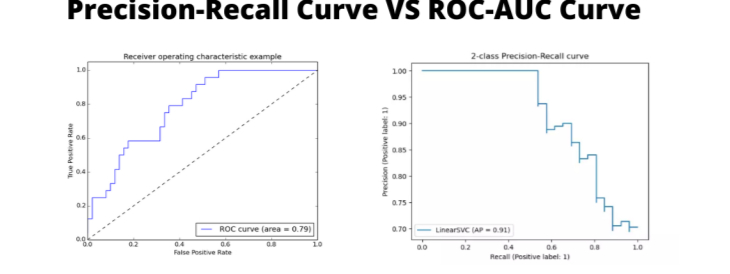
AUC ROC vs Precision-Recall Curve

Precision-recall curves are often preferred when dealing with extreme class imbalance. However, AUC ROC analysis remains valuable when overall ranking performance is the priority.
Understanding when to use each metric is critical for sound model evaluation.
Advantages of Using AUC ROC Analysis
Key benefits include:
- Threshold-independent evaluation
- Robustness to class imbalance
- Intuitive probabilistic interpretation
- Strong theoretical foundation
These advantages explain why AUC ROC analysis is widely adopted across industries.
Limitations and Common Misinterpretations
Despite its strengths, AUC ROC analysis has limitations.
Common pitfalls include:
- Ignoring real-world cost considerations
- Overlooking calibration quality
- Misinterpreting small AUC differences
Proper understanding ensures responsible use of the metric.
AUC ROC in Imbalanced Datasets
In highly imbalanced datasets, AUC ROC analysis may present overly optimistic results. Complementary metrics such as precision-recall curves should be considered in such cases.
Nevertheless, AUC ROC remains a valuable first-line evaluation tool.
Practical Implementation Using Python
Popular libraries such as scikit-learn provide built-in functions to compute AUC ROC metrics.
Typical steps include:
- Generating predicted probabilities
- Computing ROC curve points
- Calculating the area under the curve
An external reference to scikit-learn documentation can be linked here.
Best Practices for AUC ROC Evaluation
To maximize the value of AUC ROC analysis:
- Always validate on unseen data
- Compare multiple models consistently
- Combine with domain-specific metrics
- Visualize curves rather than relying solely on scalar values
Visualizing AUC ROC Curves Effectively
Visualization helps stakeholders understand model behavior. Clear labeling, proper scaling, and comparison across models enhance interpretability.
Including interactive or static plots strengthens communication and decision-making.
Future of Model Evaluation Metrics
As machine learning systems become more complex, evaluation metrics will continue to evolve. Extensions of AUC ROC analysis for multiclass and time-dependent problems are gaining attention.
Despite emerging alternatives, AUC ROC remains a cornerstone of classification evaluation.
Conclusion
AUC ROC analysis provides a powerful, reliable, and widely accepted method for evaluating classification models. Its threshold-independent nature, strong theoretical basis, and practical relevance make it indispensable for modern machine learning workflows.
By understanding how to interpret AUC curves, ROC plots, and associated trade-offs, practitioners can build more trustworthy and effective predictive systems.
FAQ’s
What is AUC in ROC analysis?
AUC (Area Under the Curve) measures how well a model distinguishes between classes, with higher values indicating better overall classification performance across all thresholds.
What is AUC and why is it important?
AUC (Area Under the ROC Curve) measures a model’s ability to distinguish between classes, and it is important because it provides a threshold-independent way to evaluate overall classification performance.
How to explain ROC curve?
The ROC curve shows the trade-off between true positive rate and false positive rate at different thresholds, helping evaluate how well a classification model separates positive and negative classes.
How to interpret AUC data?
AUC values range from 0 to 1, where 0.5 indicates random guessing, values closer to 1 show strong model performance, and higher AUC means better class separation.
Why is ROC AUC better than accuracy?
ROC AUC is better than accuracy because it evaluates performance across all classification thresholds and remains reliable on imbalanced datasets, while accuracy can be misleading.


