In today’s data-driven world, the ability to interpret complex data and communicate insights effectively is crucial. One of the most powerful tools in this process is data visualization. It transforms raw numbers into meaningful visual narratives that allow patterns, trends, and correlations to be quickly understood.
Whether you’re an analyst, a student, or a data scientist, data visualization is an essential skill. Among the many visualization tools available, the scatter plot stands out for its simplicity and effectiveness in revealing relationships between variables.
What is a Scatter Plot?

A scatter plot is a type of graph used in data visualization that displays values for typically two variables for a set of data. The data is displayed as a collection of points, each representing the values of two variables.
Each point’s position on the horizontal and vertical axis indicates values for an individual data point, making it easy to spot patterns, trends, clusters, and outliers.
Why Scatter Plots Matter in Data Visualization
Scatter plots are incredibly effective when you want to:
- Explore correlations between two continuous variables.
- Detect outliers that don’t follow the general pattern.
- Understand the distribution and spread of your data.
- Identify clusters or groupings within the data.
Real-World Relevance
For example, an e-commerce analyst might use a scatter plot to study the relationship between ad spend and sales across campaigns. This can highlight how much return on investment (ROI) is achieved as spending increases.
Components of a Scatter Plot
To fully leverage scatter plots in data visualization, it’s essential to understand their core components:
- X-axis and Y-axis: Represent the two variables being compared.
- Data points: Each plotted point represents an observation.
- Title and Labels: Describe what the graph is showing.
- Trendline (Optional): Shows the direction of the relationship.
How to Create a Scatter Plot
Scatter plots can be created using various tools including Excel, Python, R, Tableau, and Power BI. Here’s a general approach:
Steps:

- Choose two continuous variables.
- Plot the first variable on the x-axis.
- Plot the second variable on the y-axis.
- Add titles, labels, and trendlines as needed.
Real-Time Use Cases of Scatter Plots
1. Healthcare
Comparing patient age to recovery time to understand treatment efficacy.
2. Marketing
Evaluating campaign duration vs. lead conversion rate.
3. Finance
Visualizing stock prices against trading volume to identify anomalies.
4. Education
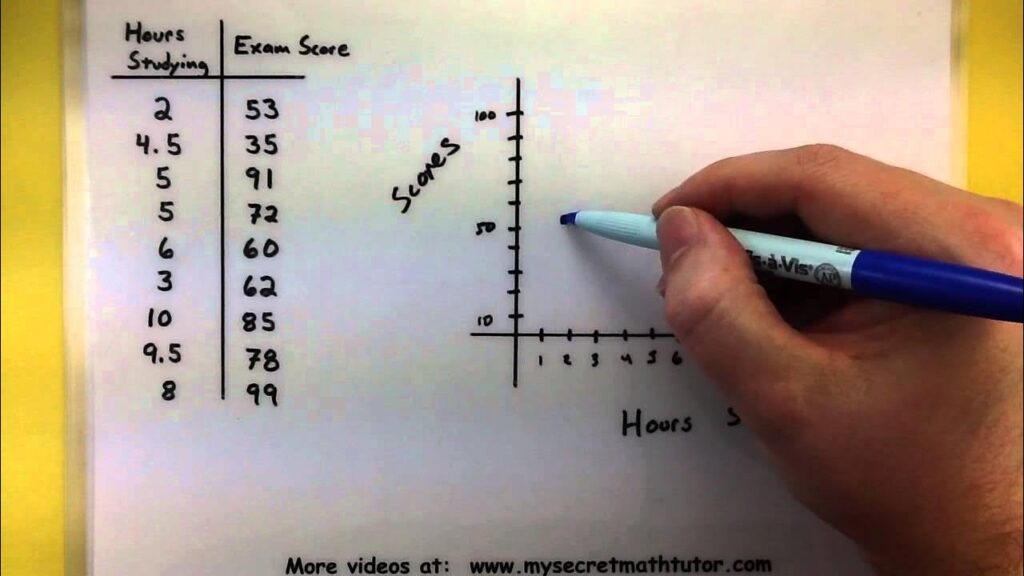
Comparing study hours to exam scores to explore performance trends.
Scatter Plot in Python using Matplotlib
import matplotlib.pyplot as plt
# Sample data
x = [10, 20, 30, 40, 50]
y = [8, 25, 30, 45, 60]
plt.scatter(x, y)
plt.title("Ad Spend vs Sales")
plt.xlabel("Ad Spend")
plt.ylabel("Sales")
plt.grid(True)
plt.show()
Scatter Plot in R Programming
# Sample data
x <- c(10, 20, 30, 40, 50)
y <- c(8, 25, 30, 45, 60)
plot(x, y, main="Ad Spend vs Sales",
xlab="Ad Spend", ylab="Sales", pch=19)
Enhancing Scatter Plots: Best Practices
To create compelling scatter plots that drive insights:
- Use color coding to represent categories.
- Add trend lines to show directionality.
- Highlight outliers using size or labels.
- Ensure axis scales are appropriate.
- Avoid overplotting by using transparency (alpha).
Example:
If plotting sales vs. marketing spend across multiple regions, assign a different color to each region.
When You Should Use a Scatter Plot
A scatter plot is the most effective choice when your analytical goal involves understanding the relationship between two numerical variables. Use it when you want to:
✔ Identify correlations
Example: Does higher website traffic correlate with increased conversions?
✔ Detect patterns or trends
Example: As temperature rises, do ice cream sales increase?
✔ Spot outliers
Scatter plots clearly highlight unusual observations that break the pattern.
✔ Understand distribution and variability
Scatter plots show whether values are tightly grouped or widely spread.
✔ Compare relationships across subgroups
You can color-code points by category (region, gender, product type).
✔ Model potential predictive patterns
Before building regression models, scatter plots help validate linearity.
If your data is continuous and your goal is relationship discovery, scatter plots are the ideal choice.
Common Issues When Using Scatter Plots
While scatter plots are powerful, misuse can lead to misinterpretation. Here are common issues to avoid:
1. Overplotting
When there are thousands or millions of points, the plot becomes cluttered.
Fix: Use transparency (alpha), sampling, or hexbin/binned scatter plots.
2. Misleading scaling
Improper scaling hides the relationship.
Fix: Use consistent axis ranges and avoid truncated axes.
3. Using with categorical variables
Scatter plots require continuous variables.
Fix: Use bar charts or boxplots for categorical comparisons.
4. Ignoring outliers
Outliers can distort perceived relationships.
Fix: highlight, analyze, or remove based on context.
5. Assuming correlation equals causation
Even if points form a pattern, it does NOT mean one variable causes the other.
6. Not labeling categories
If multiple categories exist and are not color-coded, insights are lost.
Why Are Scatter Plots Useful?
Scatter plots stand out in analytics and research because they allow:
✔ Instant visual correlation detection
Whether positive, negative, or no correlation.
✔ Trend and pattern identification
Useful before model building.
✔ Outlier identification
Crucial for fraud detection, anomaly detection, and data cleaning.
✔ Multi-dimensional analysis
You can add:
- Color → third variable
- Size → fourth variable
- Shape → fifth variable
✔ Simple, intuitive communication
Even non-technical audiences understand patterns quickly.
Scatter plots bridge raw data and decision-making, making them essential across industries.
Types of Scatter Plots
Scatter plots can vary depending on how many variables you want to analyze:
1. Simple Scatter Plot
Shows the relationship between two variables (X and Y).
2. Bubble Chart
Scatter plot with a third variable represented by bubble size.
Used in marketing, finance, and clustering.
3. Scatter Plot Matrix (Pair Plot)
Displays scatter plots for multiple combinations of variables.
Popular in exploratory data analysis (EDA).
Tools:
- seaborn.pairplot()
- pandas.plotting.scatter_matrix()
4. 3D Scatter Plot
Plots three variables using 3D space.
Used in:
- Physics
- Manufacturing
- Engineering
5. Hexbin Scatter Plot
For large datasets. Data is grouped in hexagonal bins.
Useful in big data visualizations.
6. Density Scatter Plot
Uses color gradients to show density of points.
Common Scatter Plot Options
Most tools allow powerful customization options such as:
✔ Marker shape (circle, triangle, cross, etc.)
✔ Marker size
✔ Marker color or gradient
✔ Trendlines (linear, polynomial, moving average)
✔ Transparency (alpha)
✔ Axis scaling (linear, log, square root)
✔ Grouping by color (hue)
✔ Adding annotation labels
✔ Changing grid styles
✔ Adding confidence intervals
These options enhance clarity and allow deeper insights.
Related Plots
Scatter plots are often used with or compared to these visualizations:
1. Line Chart
Shows changes over time.
Useful for time-series correlation analysis.
2. Bubble Plot
Adds a third dimension using bubble size.
3. Heatmap
Best for correlation matrices and large variable relationships.
4. Box Plot
Shows distribution patterns and outliers.
5. Violin Plot
For analyzing distribution shapes.
6. Regression Plot
Scatter plot with fitted regression line.
7. Hexbin Plot
Best for overlapping points in large datasets.
Each visualization solves a unique analytical need, depending on data size and type.
Visualization Tools for Scatter Plots
You can create scatter plots using various tools depending on your skills and use-case:
Programming Tools
Python
- Matplotlib
- Seaborn
- Plotly
- Bokeh
R
- ggplot2
- plotly
- lattice
Business Intelligence (BI) Tools
- Tableau
- Power BI
- Qlik Sense
- Looker Studio
Spreadsheet Tools
- Microsoft Excel
- Google Sheets
Cloud & Big Data Tools
- Databricks
- AWS QuickSight
- Snowflake + Hex/Streamlit dashboards
These tools support both simple and advanced scatter plot visualizations.
Practical Applications of Scatter Plots
Scatter plots are used across industries for critical decision-making:
1. Finance
- Stock price vs. trading volume
- Risk vs. return analysis
- Market movement patterns
2. Healthcare
- Age vs. blood pressure
- Dosage vs. patient response
- Medical risk factor analysis
3. Sales & Marketing
- Ad spend vs. leads
- Customer engagement vs. retention
- Multi-channel performance comparison
4. Manufacturing
- Temperature vs. defect rate
- Machine age vs. output
- Quality control analytics
5. HR & People Analytics
- Experience vs. productivity
- Training hours vs. performance improvement
6. Education
- Study time vs. exam score
- Attendance vs. grades
7. E-commerce
- Product price vs. sales
- Customer purchasing patterns
Scatter plots help businesses make strategic decisions based on real data patterns.
Roles That Require Strong Scatter Plot Skills
Understanding scatter plots is essential in many modern roles:
1. Data Scientist
Uses scatter plots for EDA, model validation, and anomaly detection.
2. Data Analyst
Uses scatter plots to present business insights and performance trends.
3. Business Analyst
Relies on scatter plots to understand customer behavior, sales, and KPIs.
4. Financial Analyst
Uses scatter plots for risk analysis, portfolio comparison, and forecasting.
5. Marketing Analyst
Analyzes ROI, engagement, and multi-channel conversions.
6. Product Manager
Uses scatter plots to identify feature impact and user behavior patterns.
7. Research Scientist
Uses scatter plots to explore experimental results.
8. BI Developer
Creates dashboards with scatter plots for decision-makers.
9. Machine Learning Engineer
Checks assumptions, correlations, and variable relationships before modeling.
10. Statisticians
Uses scatter plots for preliminary hypothesis testing and correlation analysis.
Limitations and Considerations
While scatter plots are versatile, they aren’t always suitable:
- Not ideal for categorical variables.
- Difficult to read with large datasets (can result in clutter).
- Can’t easily display more than two variables unless color/size encoding is added.
Alternatives to Scatter Plots
When a scatter plot isn’t ideal, consider these options:
- Bubble Charts: Add a third variable using size.
- Line Charts: Better for time-series relationships.
- Heatmaps: Useful for correlation matrices.
Final Thoughts
The scatter plot is an indispensable tool in the realm of data visualization. It empowers analysts to uncover relationships and patterns that are often hidden in raw datasets. Whether used in Python, R, or BI platforms, the scatter plot offers a clear, visual way to communicate complex insights effectively.
Mastering scatter plots is a foundational step toward becoming proficient in data storytelling and analytics.
FAQ’s
What are the insights of a scatter plot?
A scatter plot reveals relationships between two variables—showing trends, patterns, clusters, and outliers—making it easy to understand how one variable changes with another.
What is a scatter plot used for in data visualization?
A scatter plot is used to visualize the relationship between two variables, helping identify patterns, correlations, and anomalies within a dataset.
What are insights in data visualization?
Insights in data visualization are meaningful patterns, trends, and relationships discovered through visual charts, enabling quicker understanding and data-driven decisions.
What are the four types of scatter plots?
The four types of scatter plots are positive correlation, negative correlation, no correlation, and clustered scatter plots, each showing different relationship patterns between variables.
What are the four types of data visualization techniques?
The four major data visualization techniques are charts, graphs, maps, and infographics, each designed to present data clearly and reveal meaningful insights.


