Data alone does not provide insight unless it is summarized and visualized effectively. Large datasets often hide patterns that are difficult to identify through raw numbers or tables.
Visual tools help analysts understand trends, variability, and anomalies quickly. Among these tools, boxplots play a critical role in summarizing distributions in a compact and intuitive way.
Introduction to Boxplot in Statistics
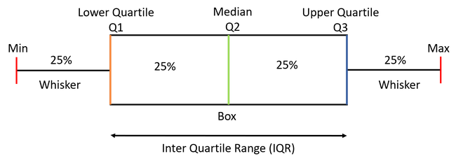
A boxplot, also known as a box-and-whisker plot, is a graphical representation that summarizes the distribution of a dataset using five key statistics.
It is widely used in statistics, data analytics, and research because it provides a clear picture of central tendency, spread, and outliers.
What a Boxplot Represents
A boxplot represents how data is distributed across quartiles.
It shows:
- The central value
- The range of typical values
- The presence of extreme values
This makes it especially useful for comparing multiple datasets side by side.
Components of a Boxplot
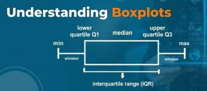
A standard boxplot consists of several components.
These include:
- Minimum value
- First quartile
- Median
- Third quartile
- Maximum value
Together, these elements form the foundation of interpretation.
Understanding Quartiles in a Boxplot
Quartiles divide the dataset into four equal parts.

The first quartile represents the point below which a quarter of the data lies. The third quartile represents the point below which three-quarters of the data lies.
Quartiles provide insight into how data is spread across ranges.
The Role of Median in a Boxplot
The median is the central value of the dataset.
In a boxplot, it is represented by a line inside the box. The position of this line indicates whether the data is symmetric or skewed.
A median closer to one end of the box suggests skewness.
Interquartile Range Explained
The interquartile range is the difference between the third and first quartiles.
It represents the middle portion of the data and excludes extreme values. This range is a robust measure of variability.
The box in a boxplot visually represents the interquartile range.
Whiskers and Their Meaning
Whiskers extend from the edges of the box to the smallest and largest non-outlier values.
They indicate the range of data that falls within an acceptable spread. Whiskers help identify the overall dispersion of the dataset.
Outliers in a Boxplot
Outliers are data points that fall significantly outside the typical range.
In a boxplot, outliers are usually represented as individual points beyond the whiskers. These points may indicate errors, rare events, or meaningful anomalies.
Understanding outliers is critical for accurate analysis.
How a Boxplot Is Constructed
Creating a boxplot follows a systematic process.
Steps include:
- Sorting the data
- Identifying quartiles
- Calculating the interquartile range
- Determining whisker limits
- Plotting outliers
This structured approach ensures consistency.
Interpreting a Boxplot Step by Step
Interpreting a boxplot involves analyzing its visual elements.
Key questions include:
- Where is the median located
- How wide is the box
- Are there many outliers
- Is the data skewed
Answering these questions reveals the story behind the data.
Boxplot vs Other Data Visualization Techniques
Boxplots differ from histograms and line charts.
While histograms show frequency distribution and line charts show trends over time, boxplots focus on summary statistics and variability.
They are especially useful when comparing multiple datasets.
Boxplot and Data Skewness Analysis
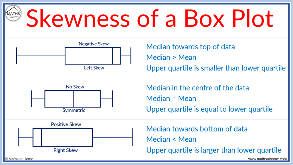
One of the most valuable insights a boxplot provides is an immediate understanding of data skewness.

Skewness refers to the asymmetry in data distribution. In a boxplot, skewness can be identified by observing the position of the median and the length of the whiskers.
- If the median is closer to the lower quartile and the upper whisker is longer, the data is right-skewed
- If the median is closer to the upper quartile and the lower whisker is longer, the data is left-skewed
This visual cue helps analysts quickly assess distribution shape without complex calculations.
Boxplot for Detecting Data Quality Issues
Data quality issues such as errors, inconsistencies, or unusual values often go unnoticed in raw datasets.
A boxplot helps identify:
- Data entry mistakes
- Unexpected extreme values
- Measurement inconsistencies
For example, a sudden cluster of outliers may indicate faulty sensors or incorrect data collection processes.
Boxplot in Financial Data Analysis
Financial datasets often contain extreme values due to market volatility.
Boxplots are commonly used to analyze:
- Daily stock returns
- Transaction values
- Expense distributions
By highlighting outliers and spread, a boxplot helps analysts assess risk and volatility more effectively.
Boxplot in Manufacturing and Quality Control
In manufacturing, maintaining consistency is critical.
Boxplots are used to monitor:
- Product dimensions
- Process cycle times
- Quality metrics
By comparing boxplots over time, engineers can detect process drift and take corrective action early.
Boxplot for Performance Benchmarking
Performance metrics often vary across teams, regions, or time periods.
Using boxplots, organizations can:
- Compare productivity across departments
- Identify underperforming or overperforming units
- Assess consistency in results
This supports fair and data-driven performance evaluation.
Boxplot in Academic and Research Studies
Researchers frequently use boxplots to summarize experimental results.
Benefits include:
- Clear comparison between experimental groups
- Visual identification of variability
- Detection of anomalous observations
Boxplots are especially useful when presenting results in academic papers and reports.
Notched Boxplots and Statistical Significance
Notched boxplots add an extra layer of information.
The notch around the median represents a confidence interval. If the notches of two boxplots do not overlap, it suggests a statistically significant difference between medians.
This feature is valuable when comparing multiple datasets visually.
Grouped Boxplots for Multivariate Comparison
Grouped boxplots allow comparison across multiple categories simultaneously.
Examples include:
- Sales distribution by region and year
- Test scores by class and subject
- Customer spending by segment
Grouped visualizations help uncover patterns across dimensions.
Boxplot and Robust Statistics
Boxplots are closely related to robust statistics.
Robust measures such as:
- Median
- Interquartile range
are less sensitive to outliers. Boxplots emphasize these measures, making them ideal for analyzing real-world data that is not perfectly clean.
Limitations of Boxplot Interpretation
While boxplots are powerful, they must be interpreted carefully.
Limitations include:
- Loss of individual data point detail
- Inability to show multimodal distributions clearly
- Dependence on sample size
For small datasets, boxplots may oversimplify patterns.
Combining Boxplot with Other Visualizations
Best practice involves combining boxplots with complementary visuals.
Common combinations include:
- Boxplot with histogram
- Boxplot with scatter plot
- Boxplot with density plot
This approach provides both summary and detailed views of the data.
Boxplot in Automated Data Analysis Pipelines
Automated analytics systems often generate boxplots as part of data validation workflows.
They are used to:
- Automatically flag anomalies
- Monitor changes in distributions
- Validate incoming data streams
This makes boxplots valuable in modern data engineering pipelines.
Interpreting Boxplots for Non-Technical Audiences
Boxplots are often presented to stakeholders without statistical backgrounds.
To improve understanding:
- Clearly label quartiles and median
- Provide short explanations alongside visuals
- Avoid unnecessary technical jargon
Clear communication ensures insights are understood correctly.
Ethical Considerations in Data Visualization
Misleading visualizations can distort interpretation.
When using boxplots:
- Avoid manipulating scales
- Clearly explain outliers
- Provide context for comparisons
Ethical visualization builds trust in data-driven decisions.
Boxplot in Predictive Analytics Preparation
Before building predictive models, analysts must understand feature distributions.
Boxplots help:
- Identify skewed features
- Decide on transformations
- Detect extreme values that may affect models
This preparation improves model performance and reliability.
Historical Context of the Boxplot
The boxplot was introduced by statistician John Tukey as part of exploratory data analysis.
Its goal was to provide a simple yet powerful summary of data distribution. Decades later, it remains a foundational visualization technique across disciplines.
Long-Term Relevance of Boxplots in Analytics
Despite advances in interactive and high-dimensional visualizations, boxplots remain relevant.
Their simplicity, clarity, and interpretability ensure continued use in statistics, business analytics, and machine learning.
Real-World Example in Salary Analysis
Salary data often includes extreme values due to high executive compensation.
A boxplot quickly shows:
- Typical salary range
- Median salary
- Presence of high-income outliers
This provides a more realistic view than simple averages.
Real-World Example in Education Data
Test scores often vary widely among students.
Using a boxplot, educators can:
- Identify performance spread
- Detect unusually low or high scores
- Compare performance across classes
This supports data-driven academic decisions.
Real-World Example in Healthcare Analytics
Healthcare metrics such as patient wait times or treatment costs are frequently skewed.
A boxplot highlights:
- Typical patient experience
- Extreme cases
- Variability across departments
This insight supports operational improvements.
Using Boxplot for Comparing Distributions
One of the strongest use cases of a boxplot is comparison.
By placing multiple boxplots side by side, analysts can compare:
- Departments
- Time periods
- Geographic regions
This makes differences immediately visible.
Boxplot in Exploratory Data Analysis
Exploratory data analysis focuses on understanding data before modeling.
A boxplot helps:
- Detect outliers early
- Assess variability
- Identify skewness
This step prevents incorrect assumptions later in analysis.
Boxplot in Business and Decision-Making
Businesses use boxplots to evaluate performance metrics.
Common applications include:
- Sales distribution analysis
- Customer spending behavior
- Operational efficiency metrics
Clear visualization supports informed decision-making.
Boxplot in Machine Learning Workflows
Before training machine learning models, data must be understood.
Boxplots help data scientists:
- Identify outliers that affect models
- Understand feature distributions
- Decide on normalization strategies
This improves model stability and accuracy.
What Is a Boxplot in R
A boxplot in R is a graphical method used to visualize the distribution of a dataset using five key statistics:
- Minimum
- First quartile (Q1)
- Median
- Third quartile (Q3)
- Maximum
R provides built-in functions to create boxplots quickly, making it one of the most popular tools for statistical visualization.
Why Use Boxplots in R
Boxplots are widely used in R because they:
- Summarize large datasets visually
- Highlight outliers clearly
- Compare multiple groups easily
- Work well for exploratory data analysis
- Require minimal code
They are especially useful before performing statistical modeling or machine learning.
Basic Boxplot in R
Example: Simple Boxplot
data <- c(12, 15, 18, 20, 22, 25, 30, 35, 40)
boxplot(data)
What This Shows
- The box represents the interquartile range
- The line inside the box is the median
- Whiskers extend to non-outlier values
- Points outside whiskers are outliers
Boxplot with Labels and Title
boxplot(data,
main = "Boxplot of Sample Data",
ylab = "Values",
col = "lightblue")
Adding labels improves readability, especially for presentations or reports.
Boxplot for Multiple Groups in R
Example: Comparing Groups
group1 <- c(10, 12, 14, 15, 18)
group2 <- c(20, 22, 25, 27, 30)
boxplot(group1, group2,
names = c("Group A", "Group B"),
main = "Group Comparison Using Boxplot")
Use Case
This approach is commonly used for:
- Comparing departments
- Examining performance across categories
- Evaluating experimental results
Boxplot Using Data Frames
Example: Built-in Dataset
boxplot(mpg ~ cyl,
data = mtcars,
main = "Mileage by Cylinder Count",
xlab = "Number of Cylinders",
ylab = "Miles per Gallon")
Interpretation
- Each box represents a cylinder group
- You can compare fuel efficiency visually
- Outliers indicate unusual vehicles
Horizontal Boxplot in R
boxplot(data,
horizontal = TRUE,
main = "Horizontal Boxplot")
Horizontal boxplots are useful when category names are long.
Boxplot with Outliers Highlighted
boxplot(data,
outline = TRUE,
main = "Boxplot Showing Outliers")
Outliers appear as individual points beyond whiskers.
Notched Boxplot in R
Notches represent a confidence interval around the median.
boxplot(data,
notch = TRUE,
main = "Notched Boxplot")
Interpretation
- Non-overlapping notches suggest a difference between medians
- Useful for statistical comparison
Boxplot Using ggplot2 (Advanced Visualization)
library(ggplot2)
ggplot(mtcars, aes(x = factor(cyl), y = mpg)) +
geom_boxplot() +
labs(title = "Boxplot of MPG by Cylinders",
x = "Cylinders",
y = "Miles per Gallon")
Advantages of ggplot2
- Cleaner visuals
- Easy customization
- Publication-quality graphics
Interpreting a Boxplot in R
When reading a boxplot, look for:
- Median position (center or skewed)
- Box size (data spread)
- Whisker length (distribution range)
- Number of outliers (data quality issues)
This interpretation helps detect patterns quickly.
Boxplots in Exploratory Data Analysis
In EDA, boxplots help:
- Identify skewed variables
- Detect anomalies early
- Decide on transformations
- Compare distributions across groups
They are often used before regression or classification modeling.
Boxplots in Business Analytics
Business analysts use boxplots to analyze:
- Salary distributions
- Customer spending
- Sales performance
- Operational metrics
Boxplots reveal variability better than averages.
Common Mistakes When Using Boxplots in R
Avoid these errors:
- Ignoring outliers without investigation
- Comparing boxplots with different scales
- Using boxplots alone without context
- Misinterpreting whiskers as min/max always
Correct interpretation ensures accurate insights.
Common Mistakes When Reading a Boxplot
Misinterpretation can lead to wrong conclusions.
Common mistakes include:
- Assuming whiskers show total range
- Ignoring outliers
- Misreading skewness
Understanding conventions avoids these errors.
Best Practices for Using Boxplots
Recommended practices include:
- Labeling axes clearly
- Using consistent scales
- Combining boxplots with summary statistics
These practices improve clarity and accuracy.
Variations of Boxplots
Several variations exist to suit different needs.
Examples include:
- Notched boxplots
- Horizontal boxplots
- Grouped boxplots
Each variation enhances interpretation in specific contexts.
Limitations of Boxplots
Despite their usefulness, boxplots have limitations.
They do not show:
- Exact data values
- Distribution shape in detail
- Multimodal patterns
They are best used alongside other visualizations.
Tools and Libraries for Creating Boxplots
Popular tools include:
- Python libraries
- R visualization packages
- Spreadsheet software
- Business intelligence tools
These tools make boxplot creation accessible.
Final Thoughts and Key Takeaways
A boxplot is one of the most effective tools for summarizing and comparing data distributions. It communicates key statistics clearly, highlights variability, and reveals outliers in a compact form.
By mastering boxplot interpretation, analysts gain a deeper understanding of their data and make better-informed decisions across analytics, business, and research domains.
FAQ’s
What is the distribution of a Boxplot?
A boxplot shows the distribution of data using the minimum, first quartile, median, third quartile, and maximum, highlighting spread, central tendency, and potential outliers.
How to describe data in a boxplot?
Data in a boxplot is described using the median, quartiles, interquartile range (IQR), whiskers, and outliers, which together show the data’s center, spread, and variability.
How do I describe the distribution of data?
You can describe data distribution by discussing its shape (symmetric or skewed), center (mean or median), spread (range or IQR), and presence of outliers.
What is the concept of a box plot?
A box plot is a statistical visualization that summarizes data distribution using quartiles, showing the median, spread, and outliers in a simple and clear way.
What are the 5 key values of a box plot?
The five key values of a box plot are the minimum, first quartile (Q1), median, third quartile (Q3), and maximum, which together summarize the data’s distribution.


